Common Mistakes in eBook Design and How to Avoid Them
Understanding the Basics of eBook Design
In today’s digital age, eBooks have become a significant medium for sharing information and stories. However, common mistakes in eBook design can tarnish the reading experience. Understanding the fundamentals of eBook design is crucial for creating a captivating and reader-friendly book.
One of the most frequent errors is ignoring the importance of a well-structured layout. A cluttered or inconsistent layout can be confusing and off-putting to readers. It's essential to maintain a clear structure and flow throughout the eBook, ensuring that each section is distinct yet cohesive.

Neglecting Mobile Optimization
With the rise in mobile reading, neglecting mobile optimization is a significant oversight. Many eBook designers fail to ensure their designs are responsive, leading to a poor reading experience on smartphones and tablets. Ensuring your eBook is mobile-friendly will broaden your audience reach and enhance user satisfaction.
To avoid this mistake, utilize flexible layouts and test your eBook on various devices. This will help you identify any issues with readability or navigation on smaller screens.
Overlooking Typography
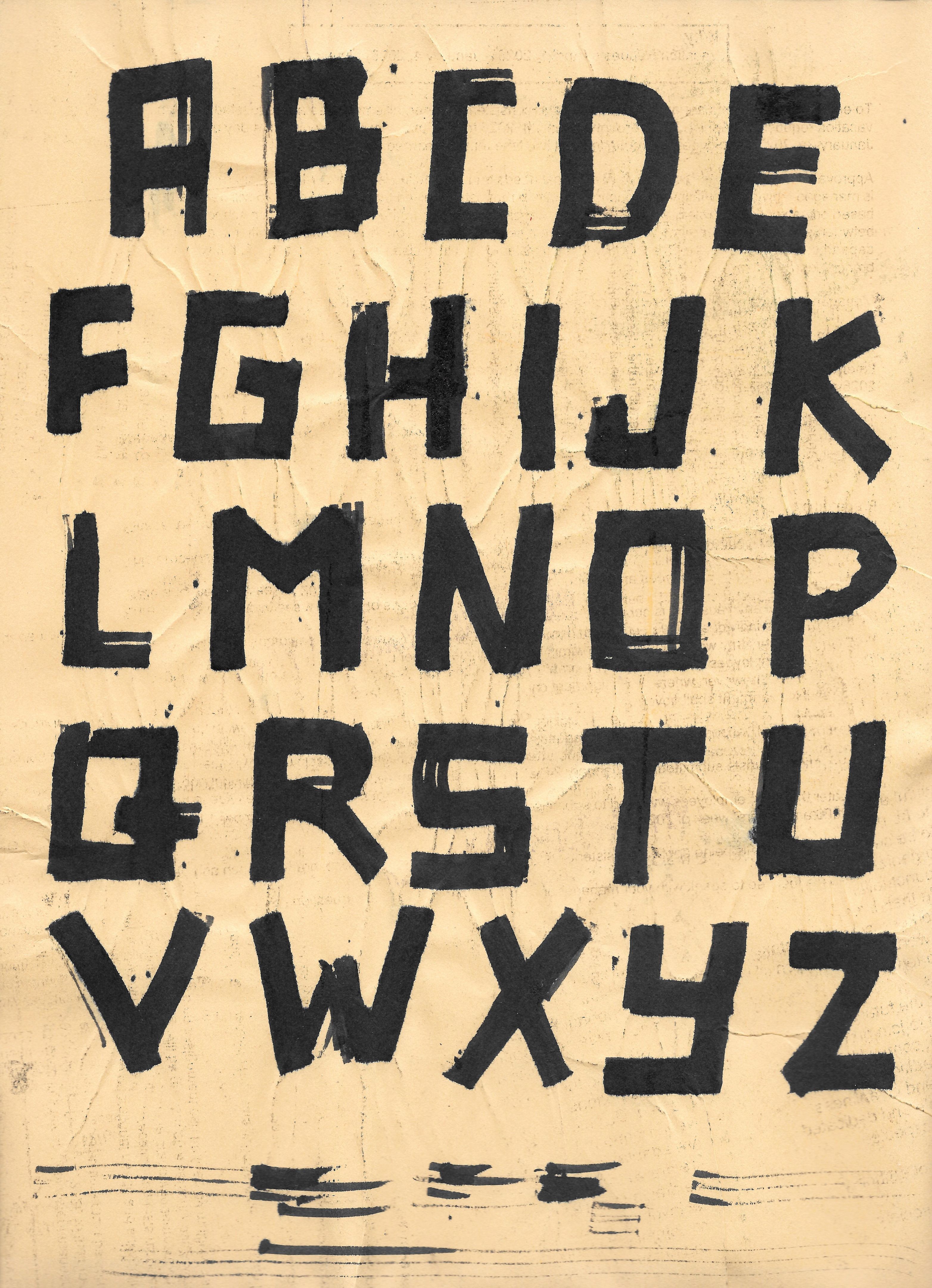
Typography plays a crucial role in the readability and aesthetic appeal of an eBook. Choosing inappropriate fonts or using too many different fonts can distract and confuse readers. Stick to one or two complementary fonts that are easy to read across different devices.

Additionally, pay attention to font size and line spacing. Too small a font or cramped lines can strain the eyes, making it difficult for readers to stay engaged. Optimal typography should guide the reader naturally through the content.
Ignoring Color Schemes
The color scheme of an eBook significantly impacts its visual appeal and readability. Using clashing colors or overly bright backgrounds can be overwhelming for readers. It's important to choose a color palette that complements the content and doesn’t distract from it.
A balanced color scheme not only enhances the visual appeal but also helps in highlighting important sections or elements within the eBook effectively.
Utilizing Images and Graphics Effectively
Images and graphics can enrich an eBook by breaking up text and providing visual interest. However, using poor-quality images or overloading pages with graphics can detract from the content. It’s essential to ensure images are high-resolution and relevant to the content.

Consider the placement of images carefully, ensuring they align well with the text and enhance understanding rather than clutter the page. Always provide alternative text for images to improve accessibility.
Testing and Feedback
Before finalizing an eBook, testing it thoroughly is vital. Many designers skip this step, leading to unnoticed errors in layout, navigation, or formatting. Conduct multiple rounds of testing on different devices and formats to catch any issues early.
Gather feedback from a sample audience to identify any areas of improvement. This collaborative approach ensures your eBook meets the expectations and needs of your target audience.
Final Thoughts
Avoiding common mistakes in eBook design requires attention to detail and a focus on the reader's experience. By prioritizing mobile optimization, typography, color schemes, and testing, you can create an engaging and professional eBook that resonates with your audience.
Remember, a well-designed eBook not only enhances readability but also reinforces your brand’s credibility and professionalism in the digital publishing world.
